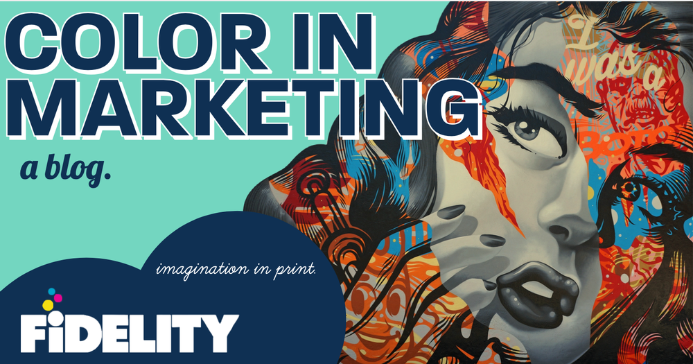
The Impact of Color in Marketing
Color is everywhere, but do you know it’s psychological importance in commercial print, marketing, and advertising? Most graphic designers could tell you the importance of red and gold in the McDonalds Arches, but does the average person know what colors trigger certain emotional effects in our minds? These critical colors play a significant role in the consumer decision-making process, so let’s take a look at what emotions certain colors target!
Red- A beautiful red, no matter the shade, creates a sense of pure urgency! The color scientifically raises blood pressure and heart rate through its psychological impact. Interestingly enough, the color is commonly tied to speed, movement, excitement, and passion. It’s pretty common to see marketers use red as a call-to-action button on an email because of the sense of urgency the button creates. According to SmallBizTrends, “McDonald’s chooses the high-energy color red (combined with yellow), which appeals to children, kindles appetites, and creates a sense of urgency. This tactic has been great for Micky D’s. It might not have been the same ridiculously big chain it is today without using the color so effectively. Red is all about emotions and passion, which is how McDonald’s wants you to feel about its products. Remember the McDonald’s advertising campaign, “Loving it.”
Green- Probably one of the first things you think of with the color green is a Summer tree, right? Marketers draw upon this color to make you feel the peace and tranquility that you could only otherwise experience in nature. Therefore, it’s no surprise that we often see green used in in-store banners and print promotions to relax and soothe clients when making a large purchase. Whole Foods is a great example of a company that tries to promote not only its close association to natural foods but also one that attempts to slow down customers as they make their way through stores. Next time you go into Whole Foods, notice the distinct emotions that the in-store music and color combination make you feel as you walk down their aisles.
Purple- For thousands of years, the color purple has been closely associated with royalty and the class distinction that comes from the wisdom associated with this position. In modern times, the association has not declined. As brands like Yahoo! and Cadbury continue to brand themselves in royal purple, the brands attempt to depict superiority, honor, and creativity in every action.
Orange- Orange is a very unique color because, as we move further away from the ’00s, fewer brands are using this color in their printed marketing campaigns. In the 2020s, marketers have tended to opt towards a more minimalistic approach that contains a more natural color palette. Yet, brands like Harley-Davidson and Nickelodeon continue to coat themselves in the vibrant color, in an attempt to differentiate themselves from existing competitors. Orange, therefore, relays a sense of pride, rejuvenation, and optimism in brands!
Yellow- Think Best Buy and Snapchat when you consider the happiness, positivity, and increased muscle energy that comes from the bright color. The two advanced companies clearly attempt to create a younger, more vibrant audience, that would love to associate themselves with the rapidly changing tech industry. There’s a reason your elementary school probably had bright yellow walls or yellow posters from a local commercial printer- the folks in charge wanted to encourage excitement and positivity in students enduring a long school day!
Blue- Blue is probably the most loved color in the country. In fact, 42% of men and 29% of women relay that their favorite colors are blue! But why is that? Well, it may just be because the color is appealing to the eye, but it could also be the common feeling of trust and reliability that comes from a brand coated in blue. American Express and Chase have mastered marketing in blue by creating a trusting relationship with people over their finances. Let’s be honest, talking about money is scary! But marketers at these companies find themselves using the color blue in many of their printed marketing materials and commercial advertising because it creates a lasting relationship that in turn promotes mutual trust.
As Nashville’s Commercial Printer, Fidelity Offset matches brands with their perfect color scheme every day. Want to see how our vibrant ink radiates brilliants colors from our work? We would love to show you our power by creating custom proofs designed to capture your audience’s attention. Click here to call a Fidelity team member, or here to email us about revolutionizing your marketing materials!